— And We’re Here For Very Peri
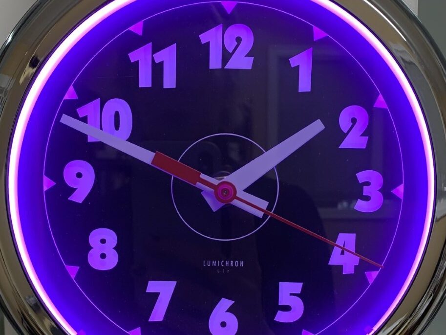
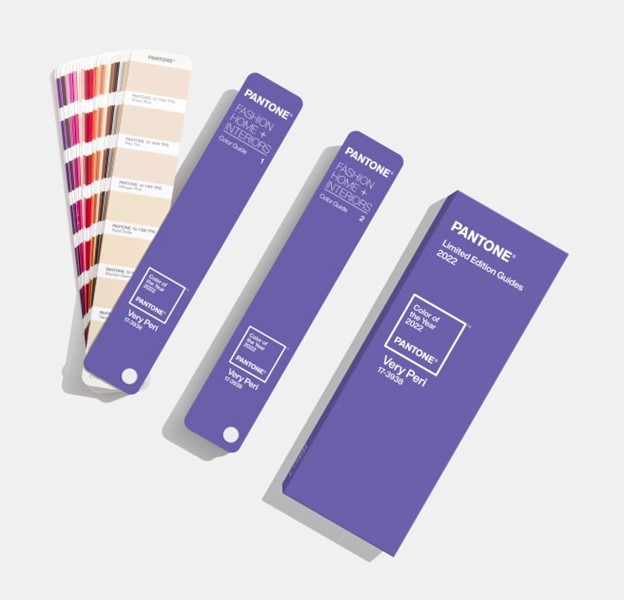
This month, Pantone announced “Very Peri” as their 2022 color of the year. According to Pantone, the violet-blue hue communicates curiosity, steadfastness, and movement.
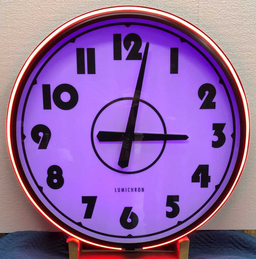
You might be asking yourself what the color of the year has to do with clocks. Well, for one thing, it’s only a few shades from our LUMICHRON logo. But it’s more than that. We’ll get to it shortly.
But first…
What is Pantone’s Color of the Year – And Why Should You Care?
If you’re not familiar with Pantone, you might wonder why their color of the year selection is such big news. Couldn’t anyone declare a color of the year?
The answer, of course, is anyone could, but Pantone’s choice matters. Pantone is literally the standard of color. Their global numbering system ensures colors stay true “from inspiration to realization.” The Pantone color system keeps brand colors consistent from digital to print, from flat sketch to fashion, and from picture to product.
Pantone chooses the color of the year based on global trends. Art, entertainment, fashion, and lifestyle factors all play into the decision. They even take into account things you wouldn’t expect — like trending travel destinations, popular sporting events, new technologies, and socio-economic trends. Color psychology also plays a huge part in the selection process.
The color of the year program has existed for 23 years. Usually, Pantone just picks an existing color. 2022’s Color of the Year is unique in that, for the first time, Pantone created a brand new color for the award — Very Peri.
A Very Peri Feeling
As we get ready to step into 2022, the world looks different than it did before. A pandemic that we’re all exhausted from lingers. And yet, there’s hope as well. The world has adapted and will continue to adapt. This landscape is the basis for the latest color of the year.
Pantone’s “Very Peri” evokes feelings of creativity and inspiration. The blue hue brings forth feelings of peacefulness, tranquility, and order — things we all wish for more of these days. The red-violet undertones give it a sense of warmth and vibrance. The color is also reminiscent of the blue light emitted by laptops and smartphone screens. In an age where we often have to be apart, this technology has become more important than ever. All of these things make Very Peri the perfect color to represent 2022.
As the color of the year, you can expect to see Very Peri pop up all over. Microsoft is already offering a free digital download of the Windows Bloom in Very Peri. While the digital space might be the first to implement the new color, it’s not the only place you’ll see it. You’ll soon find Very Peri in fashion and consumer products as well.
Very Peri also makes an appearance in architecture. Periwinkle tones are being used in various architectural elements. These include interior and exterior walls, ceilings, fixtures, and light elements. It shouldn’t come as a surprise that it can also be used in clocks!
Using Color in Clocks
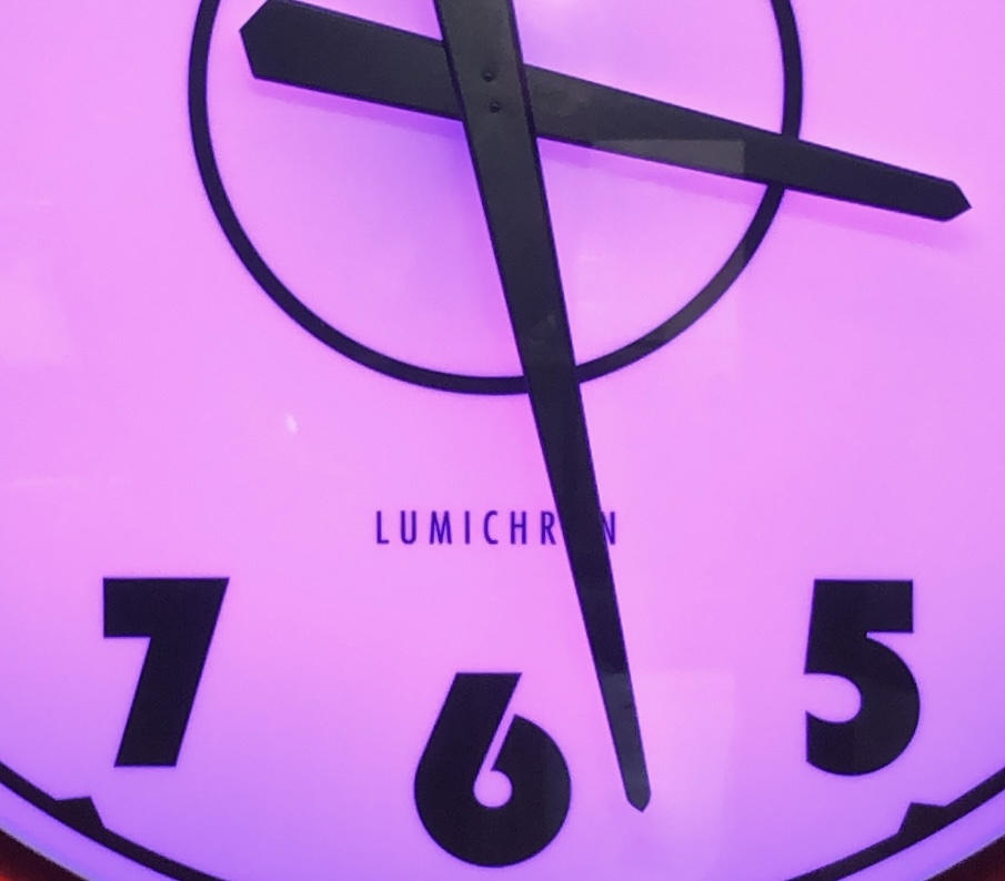
The same color psychology used in branding and design can also help you choose a color for your clock. But before you decide to hop on the latest color trend, there are other factors to consider.
Here are a few things to think about when selecting colors for your clock:
- Contrast: It’s important to use contrasting colors for the face, hands, and dial. That’s what makes the clock readable, especially from far away.
- Surroundings: You want your clock to be visible. But it should also coordinate with surrounding architecture and landscaping. A modern clock may not be the right choice for a historic building.
- Style: Certain colors are better suited to certain styles of clocks. This is especially true when it comes to lighting. In general, we recommend warmer white LEDs for classic, Roman-style clocks. Cooler tones are more suitable for clocks with modern hands and Arabic dials.
What the Pantone 2022 Color of the Year Has to Do With Clocks
Pantone created Very Peri to inspire the world to create. Their website calls it “a new Pantone color whose courageous presence encourages personal inventiveness and creativity.” The blue component provides a sense of tranquility and order. And the red-violet evokes energy and motion.
Just like colors evoke feelings, so can clocks. From a sense of nostalgia to a sense of whimsey, clocks — especially analog clocks — have the power to make us feel things.
Perhaps the nostalgia comes from their status as landmarks. When we repair or refurbish old clocks, we often hear stories about the memories they bring back. Many first dates began with the words “meet me at the tower clock.” Childhood memories include scurrying home for dinner when the old tower clock struck five.
But clocks evoke other feelings as well — and they’re the same ones Very Peri brings forth.
- Clocks Make Us Curious: Clocks convey a sense of place, piquing the curiosity of the passer-by. They make you wonder “What’s over there? What does that clock represent? Who is it keeping time for?” They also double as art. They come in various shapes, sizes, and colors to match the style of their building or benefactor.
- Clocks Bring a Sense of Order: As timekeeping devices, clocks bring order to our days. They tell you how much time you have left to complete a task. They let you know whether you’re late for your next meeting, or if you have time to grab a cup of coffee. Clocks allow us to schedule time to connect with business associates and loved ones.
- Clocks Embody Motion: Analog clocks are always* in motion. There’s comfort in knowing that no matter what, time continues to move. Your troubles won’t last forever. But time’s motion also creates a sense of urgency. Clocks are a constant reminder that time keeps going, whether we’re ready or not. They tell us to be on time, but they also remind us to make the most of it. Because we don’t get minutes and seconds back once they’ve passed.
- Clocks Represent the Best in Technology: Clocks have been around for hundreds of years. Clockmakers continue to make the most of the technology available to them. In the beginning, that meant setting up a gnomon and following the shadow of the sun. Now, Atomic Clocks keep time with exceptional accuracy. GPS signals keep your clock accurate within a few seconds. Our clocks even reset themselves after power outages, and adjust automatically for Daylight Savings Time.
As you can see, the 2022 Pantone Color of the year has more in common with clocks than you’d think!
Lumichron’s design-centered approach ensures our customers get the right clock for their space. Contact us for a quote today. With over 35 years of experience building custom clocks, we’ll bring your vision to life.
*A Swiss Railway Clock could be considered an exception to the always in motion concept. These clocks only move once per minute, like a digital clock. Still, that’s frequently enough to make us feel like time is moving, rather than standing still.


